Showing posts with label Artist Collaborations. Show all posts

Reservoir Press Thinks Outside the Card


In its continuing effort to push design in letterpress, the team at Reservoir Press went beyond the typical geometry for a wedding invite. Looking to stand out, this invite literally pops off the page.

Once again collaborating with Brooklyn-based artist, Lis Timpone, our press worked to find a technical solution that would take this beautiful design to another dimension. At Reservoir we always strive to work with fresh ideas, so that our work will really stand out. This way our clients always walk away with a design that is unique to them.

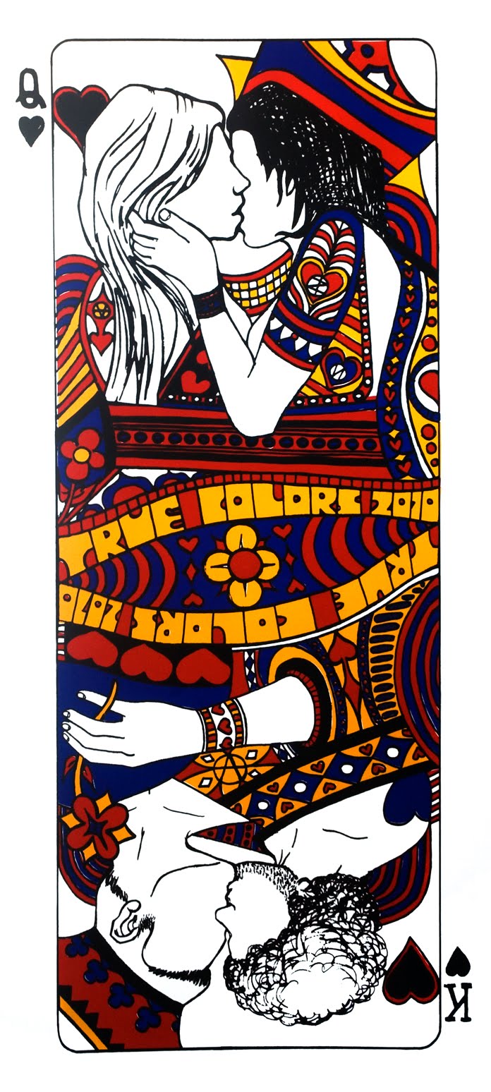
A Charity Print to Benefit the True Colors Fund


Co-founded by Cyndi Lauper, the True Colors Fund is a charitable organization whose mission is to support GLBT civil rights causes. The team at Reservoir Press worked with New York-based artist Calder Zwicky to design a print that was bold (19" x 42"), beautiful, and would be versatile enough to be viewed in any orientation.

The team that worked on this print was proud to play a small role in support of one of the most critical issues of our time.

Death Collective: Commemorative Poster from a Queens Museum of Art Exhibit


Designed by the instillation artists, this black-on-black silkscreen poster functioned as a limited edition, take-away print that celebrated the opening of the Death Collective’s installation at the Queens Museum of Art. The prints were numbered and signed, but also made to be taken home by visitors of the show. If there was ever an argument for the beauty of the reproductive print, it would be in the opportunity that Reservoir Press had here to make museum goers feel like they could take a piece of the museum home with them. It celebrates both the value inherent in a work of art, and the culture of sharing that is permitted when you can make enough for people to share intimately in that experience. This print was about breaking down the authoritative “look, but don’t touch” atmosphere of the museum space. This print was about granting greater access to art. This print was about why I print.

Custom Band Poster for Canadian Indie Rockers Hunter Valentine

Designed by sculptural artist J.P. Villegas, Reservoir Press created a custom poster for Hunter Valentine's performance at the Bergen Performing Arts Center in New Jersey. In the great tradition of custom rock band posters, this three color silkscreen was a limited edition poster for this special performance where the band opened up for Cyndi Lauper.

Putting a little spin on Harvey Milk's famous quote "I'm here to recruit you" from his Hope Speech in 1973, Jason at Reservoir Press came up with the slogan "We're Here to Recruit You" for this poster, which the band subsequently titled their live DVD filmed on the 40th Anniversary of the Stonewall Riots in New York City. The poses for the figures were also inspired by Tommie Smith and John Carlos’ black power salute at the 1968 Mexico Olympic games.

http://en.wikipedia.org/wiki/1968_Olympics_Black_Power_salute

The goal of this layering of symbolism was to not only boldly announce the new American presence for this band, but to state in no uncertain terms that their presence as a band was both to entertain and to stand up for social justice.

Check out one of the tracks from Hunter Valentine’s “We’re Here To Recruit You” DVD:

Working from a drawing: "Air"


Using a unique blending and layering technique, painter John Gonzalez and I combined greens, reds, purples, blues and yellow hues to create a print from one of his finished drawings. While the goal was to capture the subtle tonal interpretation of the artist’s pencil drawing, “Air”, we also found great satisfaction in using letterpress in a manner that mimicked John’s working style as an oil painter. With successive layers of thin oils John is able in paint to create richly varied colors that stand alone, but also mix optically right on the canvas. Never having worked in a printmaking medium before, John was thrilled to find that the process we chose to create this particular print was a technique familiar to him. The result of this collaboration is a limited-edition print whose process was as much an adventure of discovery, as its surface is a mix of colors that continuously emerges and evolves with each new inspection.


Working with Artist Lis Timpone and the Beginning of the Baby Bestiary Project: A Compendium of Beasts in Baby Book Format


[Picture of Lis' Wolf and Rabit lithograph]

I first met visual artist Lis Timpone at the Robert Blackburn Printmaking Workshop in Manhattan. We worked together to translate one of her magnificent animal drawings into the lithograph above for an upcoming show of hers. Lithography was an ideal medium for her, since her drawings are so rich and subtle. Instead of having only a single image to sell to her clients, she now had access to a medium that allowed her to preserve the mark of her hand, but in an edition size that allowed her work to be owned by a wider audience.

Her drawings were so intoxicatingly beautiful, that recruiting her to work with me was a foregone conclusion. I was also convinced that letterpress would be a medium that would allow for incredible interpretations of Lis' drawings. The incredible detail and accuracy capable in letterpress allows all the nuanced lines in her drawings to really sing. I argued hard to have her do a project in letterpress for Reservoir. Lis was reluctant at first, since she had had some less than ideal experiences with a silkscreen printer trying to reproduce her work. But I was confident that letterpress was the right medium. So I offered to make her a business card at no cost. If she liked the results, then maybe we could work together on a fine art project. With this bargain struck, and feeling the need to always keep things fresh, we came up with the following:

It worked. Lis was pleased, and I was pleased. We decided that a collaborative relationship was going to be beneficial for both of us, and off we were to producing our first major project together - a baby alphabet book. Trying as always to keep things fresh, we decided to make this unlike other alphabet books out there. We settled on the idea of making a bestiary in the model of medieval compendiums of fantastic creatures.

Needless to say, Reservoir Press is excited to be working again with Lis on this project. The book, when completed, is supposed to be something of both beauty and wonder. Children will have lovely drawings of curious creatures to look at and rediscover with each new reading. Adults will have little blurbs about each animal that hopefully will surprise and fascinate them too. The images above are only test prints, while the final images will be bound in book format, with beautiful lettering and fun little facts about each creature. Lis and I hope that the experience of this book will be one that is rich for all readers, and will provide a fun point of contact between the young and the not-so-young.

Reproduction Meets the Unique Print


This project represents a collaboration with artist Nicole Hayes of nicoceramics. The tree like portions of the image were reproduced many times with a letterpress onto a fine art paper that was then hand watercolored to make each one unique. Above there are just two examples of this blending of a reproductive medium with the individualized touch of the hand.

At Reservoir Press we are always looking for ways to make a traditional art form fresh and experimental.

Obscure Holiday Cards

This card is part of a set of Obscure Holiday Cards that is due out this summer. The set is made of of 14 cards that are each designed by a different artist, and celebrate those holidays that Halmark forgot. Above is the No Pants Day card designed by artist John Gonzalez for Reservoir Press.

A Print to Honor Master Printer
Bob Blackburn


Robert Blackburn Printmaking Workshop members Jason Riffaterre (owner of Reservoir Press) and Justin Sanz work together to print a commemorative image of world renown master printer Bob Blackburn. The image was printed from a woodblock carved by Justin, and it posed a real challenge for Reservoir's letterpress jobber. Letterpress machines like the one pictured above were not built to print large areas of color from blocks, but with a bit of patience and ingenuity we were able to reproduce this fine image over two hundred times. The prints filled every bit of free space in the shop as they were laid out to dry, and the studio was filled with the wonderful smell of drying ink.

Reservoir Press is always ready to take on any challenge in pursuit of a beautiful print job.