Reservoir Press Thinks Outside the Card


In its continuing effort to push design in letterpress, the team at Reservoir Press went beyond the typical geometry for a wedding invite. Looking to stand out, this invite literally pops off the page.

Once again collaborating with Brooklyn-based artist, Lis Timpone, our press worked to find a technical solution that would take this beautiful design to another dimension. At Reservoir we always strive to work with fresh ideas, so that our work will really stand out. This way our clients always walk away with a design that is unique to them.

Reservoir Press Participates in a letterpress print exchange: “The Moon”

“The Moon” is Reservoir Press’ contribution to a recent letterpress print exchange. In a print exchange each contributing printmaker submits an edition of prints equal in size to the number of participants. The collection would be collated, and then each participant would receive in exchange for their contribution a complete collection of prints from all the participants.

Since this print was to be shared with other letterpress printers, the challenge was to make a print that would be both beautiful and technically sophisticated. Printing large areas of deep black is not something that letterpress does particularly well, but with the moon print I really wanted to emulate the richness of blacks found in outer space. This seven color print was my attempt to solve this problem with careful layering of colors. The end result, I think, was a field of dark color around the moon that upon close examination was made up of both cool and warm hues.

But more than anything else, “The Moon” represents for me a departure from standard practice in letterpress. This is what I want out of my work as a printer. To be pushing boundaries; to be experimental; to beg the press to function beyond its design; to keep the work fresh and challenging. In the end, I hope that a letterpress printer can look at this print and say, “I can’t believe that was made with a letterpress.”

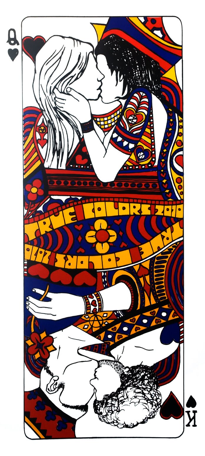
You can find some of the other prints in this exchange here.

A Charity Print to Benefit the True Colors Fund


Co-founded by Cyndi Lauper, the True Colors Fund is a charitable organization whose mission is to support GLBT civil rights causes. The team at Reservoir Press worked with New York-based artist Calder Zwicky to design a print that was bold (19" x 42"), beautiful, and would be versatile enough to be viewed in any orientation.

The team that worked on this print was proud to play a small role in support of one of the most critical issues of our time.

Death Collective: Commemorative Poster from a Queens Museum of Art Exhibit


Designed by the instillation artists, this black-on-black silkscreen poster functioned as a limited edition, take-away print that celebrated the opening of the Death Collective’s installation at the Queens Museum of Art. The prints were numbered and signed, but also made to be taken home by visitors of the show. If there was ever an argument for the beauty of the reproductive print, it would be in the opportunity that Reservoir Press had here to make museum goers feel like they could take a piece of the museum home with them. It celebrates both the value inherent in a work of art, and the culture of sharing that is permitted when you can make enough for people to share intimately in that experience. This print was about breaking down the authoritative “look, but don’t touch” atmosphere of the museum space. This print was about granting greater access to art. This print was about why I print.

Custom Band Poster for Canadian Indie Rockers Hunter Valentine

Designed by sculptural artist J.P. Villegas, Reservoir Press created a custom poster for Hunter Valentine's performance at the Bergen Performing Arts Center in New Jersey. In the great tradition of custom rock band posters, this three color silkscreen was a limited edition poster for this special performance where the band opened up for Cyndi Lauper.

Putting a little spin on Harvey Milk's famous quote "I'm here to recruit you" from his Hope Speech in 1973, Jason at Reservoir Press came up with the slogan "We're Here to Recruit You" for this poster, which the band subsequently titled their live DVD filmed on the 40th Anniversary of the Stonewall Riots in New York City. The poses for the figures were also inspired by Tommie Smith and John Carlos’ black power salute at the 1968 Mexico Olympic games.

http://en.wikipedia.org/wiki/1968_Olympics_Black_Power_salute

The goal of this layering of symbolism was to not only boldly announce the new American presence for this band, but to state in no uncertain terms that their presence as a band was both to entertain and to stand up for social justice.

Check out one of the tracks from Hunter Valentine’s “We’re Here To Recruit You” DVD:

Working from a drawing: "Air"


Using a unique blending and layering technique, painter John Gonzalez and I combined greens, reds, purples, blues and yellow hues to create a print from one of his finished drawings. While the goal was to capture the subtle tonal interpretation of the artist’s pencil drawing, “Air”, we also found great satisfaction in using letterpress in a manner that mimicked John’s working style as an oil painter. With successive layers of thin oils John is able in paint to create richly varied colors that stand alone, but also mix optically right on the canvas. Never having worked in a printmaking medium before, John was thrilled to find that the process we chose to create this particular print was a technique familiar to him. The result of this collaboration is a limited-edition print whose process was as much an adventure of discovery, as its surface is a mix of colors that continuously emerges and evolves with each new inspection.


Working with Artist Lis Timpone and the Beginning of the Baby Bestiary Project: A Compendium of Beasts in Baby Book Format


[Picture of Lis' Wolf and Rabit lithograph]

I first met visual artist Lis Timpone at the Robert Blackburn Printmaking Workshop in Manhattan. We worked together to translate one of her magnificent animal drawings into the lithograph above for an upcoming show of hers. Lithography was an ideal medium for her, since her drawings are so rich and subtle. Instead of having only a single image to sell to her clients, she now had access to a medium that allowed her to preserve the mark of her hand, but in an edition size that allowed her work to be owned by a wider audience.

Her drawings were so intoxicatingly beautiful, that recruiting her to work with me was a foregone conclusion. I was also convinced that letterpress would be a medium that would allow for incredible interpretations of Lis' drawings. The incredible detail and accuracy capable in letterpress allows all the nuanced lines in her drawings to really sing. I argued hard to have her do a project in letterpress for Reservoir. Lis was reluctant at first, since she had had some less than ideal experiences with a silkscreen printer trying to reproduce her work. But I was confident that letterpress was the right medium. So I offered to make her a business card at no cost. If she liked the results, then maybe we could work together on a fine art project. With this bargain struck, and feeling the need to always keep things fresh, we came up with the following:

It worked. Lis was pleased, and I was pleased. We decided that a collaborative relationship was going to be beneficial for both of us, and off we were to producing our first major project together - a baby alphabet book. Trying as always to keep things fresh, we decided to make this unlike other alphabet books out there. We settled on the idea of making a bestiary in the model of medieval compendiums of fantastic creatures.

Needless to say, Reservoir Press is excited to be working again with Lis on this project. The book, when completed, is supposed to be something of both beauty and wonder. Children will have lovely drawings of curious creatures to look at and rediscover with each new reading. Adults will have little blurbs about each animal that hopefully will surprise and fascinate them too. The images above are only test prints, while the final images will be bound in book format, with beautiful lettering and fun little facts about each creature. Lis and I hope that the experience of this book will be one that is rich for all readers, and will provide a fun point of contact between the young and the not-so-young.

Reproduction Meets the Unique Print


This project represents a collaboration with artist Nicole Hayes of nicoceramics. The tree like portions of the image were reproduced many times with a letterpress onto a fine art paper that was then hand watercolored to make each one unique. Above there are just two examples of this blending of a reproductive medium with the individualized touch of the hand.

At Reservoir Press we are always looking for ways to make a traditional art form fresh and experimental.

Obscure Holiday Cards

This card is part of a set of Obscure Holiday Cards that is due out this summer. The set is made of of 14 cards that are each designed by a different artist, and celebrate those holidays that Halmark forgot. Above is the No Pants Day card designed by artist John Gonzalez for Reservoir Press.

Kissing Card

Give this business card to your loved one, and get down to business.

The Handbook of Beauty


These images, borrowed from a 1950's text called "The Handbook of Beauty," recall another era. More from this line will be out by the summer.

Checking you out!


Some handset type redifines the meaning of this odd antique plate.

Vintage Cuts


A simple card that was letterpressed with a vintage plate and an assortment of type. All handmade and without the use of any of the modern technology available to letterpress printers today.

The Special Series


These special cards were made from old fashioned plates found in flea markets around the city. Some handcarved linoleum blocks adds some variety to the mix. Expect more from the "Special" series by this summer.


A Print to Honor Master Printer
Bob Blackburn


Robert Blackburn Printmaking Workshop members Jason Riffaterre (owner of Reservoir Press) and Justin Sanz work together to print a commemorative image of world renown master printer Bob Blackburn. The image was printed from a woodblock carved by Justin, and it posed a real challenge for Reservoir's letterpress jobber. Letterpress machines like the one pictured above were not built to print large areas of color from blocks, but with a bit of patience and ingenuity we were able to reproduce this fine image over two hundred times. The prints filled every bit of free space in the shop as they were laid out to dry, and the studio was filled with the wonderful smell of drying ink.

Reservoir Press is always ready to take on any challenge in pursuit of a beautiful print job.

A 12-Color Print for a Destination Wedding


The team at Reservoir worked to create a totally unique and different Save-the-Date card for a couple who were travelling to Ravello, Italy for their wedding. The idea was to create a travel poster styled after the Art Deco posters of the late nineteenth and early twentieth centuries. The result was a 12-color card that blended silkscreen and letterpress. The landscape was silkscreened to take advantage of the medium's ability to print areas of color vibrantly and evenly, while the buildings were letterpressed to not only give them texture, but make them pop off the page as well.

Reservoir will spare no effort and will take on any technical challenge to meet its clients unique needs.

Reservoir Prints Business Cards for Artist
Justin Sanz


The team at Reservoir Press worked with printmaker and muralist Justin Sanz to create a new business card. The process started when Justin took one of his amazingly detailed woodcuts and reduced it to a size that would fit on a standard card. Then the team at Reservoir Press worked with the precision of letterpress printing to make all of the design's glorious detail apparent to all of the artist's clients to whom he gives his calling card.

With this card project, Reservoir worked to produce a card for Justin that would be in keeping with the artistry and technical skill typical of his work.

Reservoir Press Prints for Artist Sean Scully


Reservoir Press recently had the opportunity to print a special holiday card for world-renown artist Sean Scully. The artist produced a drawing that the team at Reservoir Press translated into a printing plate. Each card was meticulously crafted by hand to preserve the quality of a fine art print. Reservoir Press is pleased to have provided letterpress services to Mr. Scully who has exhibited widely in Europe and the United States, and is represented in the permanent collections of a number of museums and public galleries, including the Museum of Modern Art and the Guggenheim Museum in New York, the National Gallery of Art and the Smithsonian American Art Museum in Washington, D.C., the Fine Arts Museums of San Francisco, the Museum of Fine Arts in Boston, the National Gallery of Australia, the Tate Gallery in London, the Irish Museum of Modern Art in Dublin, and many other private and public collections worldwide. Some of his work was recently the subject of a show at the Metropolitan Museum in New York. You can view works from this exhibition by clicking here.

Reservoir Press is always ready to work with artists to help them produce functional or fine art letterpress. Artist designed cards are very hot now, and Reservoir Press prides itself on being on the cutting edge of letterpress production today.

A Plantation Wedding


Reservoir Press was ready to brainstorm with this client to help form a vision of what the invitation package would look like, and then created Save-the-Date, Invitation, and RSVP cards that realized their vision. Each card was meticulously designed to work together as a group of images and yet allow each to have a distinctive quality. What truly marks this project as special is the attention to the details that relate to the location of the wedding. All aspects of the design work to evoke the plantation elegance of the wedding's site, as well as recall an old world style that is truly American.

The design team at Reservoir Press works diligently to make certain that each job is a reflection not only of the client's wishes, but also a body of work that each client can claim is unique to them.

Happy Holidays from Reservoir Press


The holidays were celebrated this year with a special card from Reservoir Press. Combining silkscreen and letterpress, Jason (the owner of Reservoir Press) and his wife Jessica wanted to send a little something beautiful to their friends.

Reservoir Press is always ready to make a unique print for any client who wants to let their friends, family, or clients feel like they have been treated to something truly special.

A Thank You Card for Hunter College


Hunter's School of Education needed to say "thank you" in a special way to those principals whose high schools and elementary schools partnered with the college. Reservoir Press was the printer of choice to create a card with a sophistication that would make their thanks particularly special. The design team at Reservoir Press used one of Hunter's logos and precisely matched the school's color in order to create a card that was both elegant in its simplicity and had an aesthetic that marked a truly professional organization.

A Special Last Night


When Andrew and Sarah were about to tie the knot, they needed a rehearsal dinner invitation that would take the edge off the formality of the big wedding day to come. Having had a very traditional wedding invitation made, the couple wanted something simple and fun, but without sacrificing elegance. Reservoir Press worked to design a card that would evoke the stylistic theme of their invitations, but would also meet their need for something different ... something that was truly theirs and no one else's.

The design team at Reservoir Press will always go the extra mile to produce in letterpress a card that is tailored to the client's unique needs.

A Multinational Announcement


Our client Sarah is a vital, young French woman living in America. When she gave birth to twins and wanted to announce the big day to both her French and American friends and family, the team at Reservoir Press was ready for this unique design challenge. A layout was conceived for both the announcement and the return address (to accommodate her homes both in the US and Europe) that would spread the news across the language barrier. But the design team went even further for this client. Sarah's love of old fashioned toys was also incorporated into a design meant to evoke both her own childhood, as well as the passing on of tradition to her children.

Typical letterpress studios that work with generic, pre-designed templates could not have met Sarah's needs the way we could. That is why our focused attention to our client's individuality makes Reservoir Press excell in its letterpress production.

A Truly Handcrafted Announcement


When the Tripletts sent Reservoir Press the text for the baby announcement card the handwriting was so perfect that the design team at Reservoir Press used it to create the plate for printing the cards and the envelopes. Merry and Cliff are outdoor types, so the card was crafted to reflect not only the love for their newborn, but also the love for the world into which they brought him. The image of the tree and the handwritten text were both crafted by the client. Reservoir then took the design the next step through an unusual combination of letterpress and silkscreen to create a truly unique look for this medium.

We at Reservoir Press are always looking to work closely with our clients to create a personalized and treasured memento in letterpress and beyond.

A Traditional Wedding with a Personal Touch


After searching online in vain for a wedding invitation that would be both personal and of the highest quality, Ms. Beyene came to Reservoir Press. We worked with her to produce the look that she wanted, but on a paper that was rich in texture and by a printing technique that has a distinctive old world style. The end result was a complete wedding package that not only had a unity of design, but that was crafted by hand with the greatest care and individualized attention.

A Big Card for a Big Client


Reservoir Press will help to make reality any presswork the client desires. In this case a photographer wanted a business card that would be as original and unconventional as her own work. The team at Reservoir worked to make sure that this card, designed by Alison Forner, was printed to the client's exacting specifications. From color to size no detail was left to chance. From the precise cutting work for the border to the pressure and kiss impressions used in the different parts of the card, this job was as important to Reservoir as it was precious to the client.

Personalizing the Wedding Announcement


After looking around in vain for a wedding invite, our client came to Reservoir Press looking for a design that would be truly personal. This artistically inclined couple loved to kayak together, and decided that they wanted that activity so meaningful and special to them to be present in their invite. Looking to old maps, a design was made that represented the spot on the Delaware River where they lived out their dreams. By having it letterpressed through Reservoir they also told their friends that this occasion was as unique as their love.

Designed in this case largely by the client, the team at Reservoir Press worked hard to make sure that this part of their dream was made a reality.

Reservoir's Custom Stationery Design


Reservoir Press is proud to be able to design highly personalized stationery. The emblem for this envelope and note paper set was invented to match the client's name. The ermine in the crest is a play on the client's name. Our design research team also looked far and wide before finding the perfect background, which was a medieval pattern called Plain Ermine.

Not only does the embossing on both the envelope and paper give the project that luxurious hand made look, but the coral color matched the client's favorite hue, thus making this project typical of the brand of highly customized creations at which Reservoir Press excells.

A Custom Birth Announcement for a Client in The Big Easy


This unique birth announcement was created by Reservoir Press specifically for this one project. Our design team made all the drawings for this invite, from which the perfect one was ultimately selected. Selecting the right design, ink color, text, paper, and envelopes is all part of the process of tailoring each job to the specific needs of our clients.

This is the Reservoir way.

Getting Ready to Cheer


On the big day of the world's most famous marathon, our client wanted to make sure that their annual celebration would have an invitation as special as the people they were cheering on and the people who were going to be cheering with them. The artists at Reservoir Press worked with the client to create a series of proofs, which finally led to the design that expressed exactly what they wanted.

At Reservoir Press no effort is too great to get it right for our customers.

Reservoir Press Throws a Party


When it was time to throw a double birthday party, Reservoir Press was on the job to make the invitation equal to the occasion. The party's theme was half Chinese and half Karaoke. To capture both elements Reservoir designed a special invitation that would not only be fun, but would also reference the Chinese zodiac and the respective symbols for each of the two hosts. A highly specialized design worked through several proofs until the invitation was right.

At Reservoir Press we produce each job as if we were doing it for ourselves.

Client Designed Business Cards


It is not unusual for a client to come to Reservoir Press with their business card already designed. Our production staff is happy to take your design and execute it in letterpress with the right color and on the right paper so that it has that perfect look and feel when you pass your card to your own clients. This job had a very clean design, which was exquisitely complemented by the beautiful emboss that the paper took from the type.

Clean, simple, gorgeous.

Another Reservoir Card


Hand-set type was used to create this relatively conservative business card. The deckle (or rough edge) at the bottom of the card marks that little bit of stray from the norm that allows us to say that we can produce anything from the most corporate looking cards to the most artistic.

At the heart of all Reservoir Press designs, however, is the presence of the hand-made in each card that identifies the owner as someone who cares to have the very best representing them.